Coverage and Camera Angles
When we shop in a physical department store we are able to pick up the product and inspect it. We are able to get a feel for the texture, the size, we can clearly see the colour, we are able to move it around and look at it from different angles. But when you are shopping online you can’t do any of that. So it's really important when you are creating images for your online store, that you recreate that experience for your shopper. So in this post I’m going to run through some of the coverage, camera angles and informative images I would suggest to populate your online stores.
MAKE SURE YOUR IMAGES PROVIDE INFORMATION
Through your product photos, you need to visually answer any questions for your shoppers. Sure the answers may be in the product descriptions but these days online shoppers have very little patience, so we want to answer questions with images rather than making them read fine print. Questions you can answer visually are things like:
Exactly how big your item is
What exact colour shade it is
How it looks when it is in use
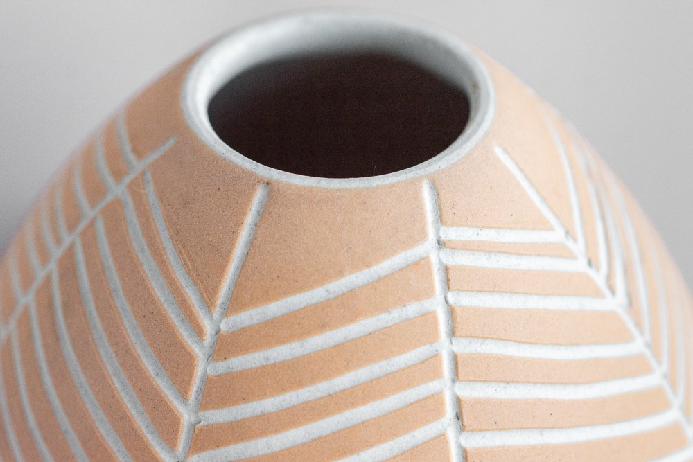
Any intricate aspects of the product that customers might want to inspect such as fabric, print detail or texture.
CAMERA ANGLES
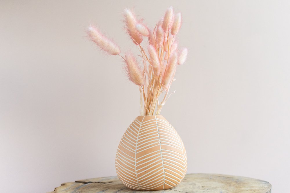
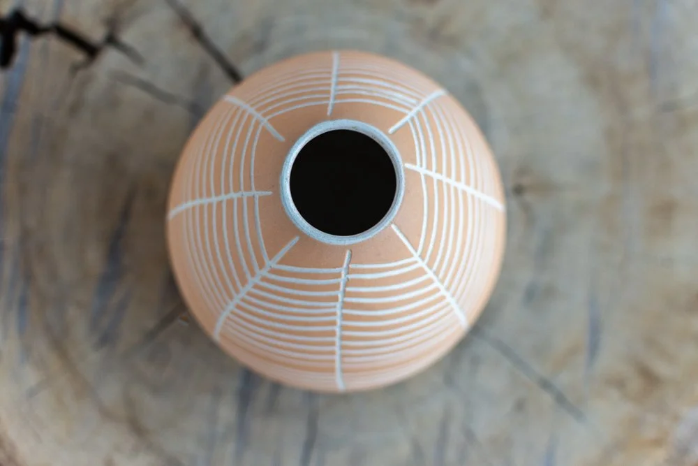
As a rule of thumb, your main hero image should be an eye-level head-on view of your product. It's recommended to have anywhere up to 6 additional supporting images. Your supporting images should explore some different vantage points of the product and highligh the most important features of your product. Here are some camera angles to try:
CONSISTENCY
Be sure to keep your relative distance between the product and the camera the same so that the framing is the same in each image. The best way to do this is to use a tripod.
Mount your camera and tripod and once you find a framing that you like, shoot all your products one at a time in this framing. Once complete, try a different camera angle, then shoot all your products in the next framing set up. Keeping the framing the same for each product will ensure that all your final shots will be consistently framed the same and will reduce your editing workload.
OK, so there you have it. I hope this blog has been helpful and gave you some ideas for taking image for your online stores. As always, if you create anything awesome please share your pics in the Facebook Group Photography for Makers - I’d love to see your work!


